- Published on
Atomic Design in React & React Native Applications
Table of Contents
If you navigate to the file structure section of React’s website, the very first sentence states:
React doesn’t have opinions on how you put files into folders.
Not very helpful if you look at it skin deep. However, what this sentence is really saying is not that the **creators of React don’t care where you put your files, but that the library itself doesn’t care**. React will “react” the same way to your application’s changes no matter if your application exists entirely in one index.js file or if every bit is broken out into separate folders and files. It is up to you to decide how you want to structure things.
Now, even though they state that React doesn’t have an opinion, they do offer some patterns that you can follow until you feel that they’re no longer applicable for your needs.
Atomic Design
As we build out scalable applications in React, we often face challenges in maintaining the growing complexity of component structures. In projects where there are hundreds of components, it is not easy to remember everything. The need for some kind of a design system appears when we start to get overwhelmed by the count of components on a project.
One of the exciting concepts that React has brought into the ecosystem is componentization. However, in a lot of React projects, a lot of developers fail to take full advantage of this concept and repeatedly violate the DRY principle. This is possibly due to the absence of standard best practices for design patterns in the React Docs as most codebases are built upon the opinions of the individuals contributing to it.
Atomic design can help solve these problems.
Atomic design is a methodology for designing and developing user interfaces in a modular manner by putting the focus on building components rather than applications. It is popularly known within the design world and helps to build consistent, solid and reusable design systems. This is because Atomic Design is very calculated and controlled when it comes to the building blocks of the design. Working in a similar way to a classic design system, Atomic Design keeps teams from having many versions of the same components or duplicates that offer slightly different styles.
We also have those who say that Atomic Design is really a mind model as opposed to a style or framework. It invites designers to look at their pages and products as a complex group of organisms, with each little element playing a crucial role in its own right.
The big advantage of using Atomic Design is that you can make your Apps look and feel the same and that every change that you make in a component will be spread across your other components & projects, not needing to update them independently and having to maintain them, if it works in one project it should work in all of them, however, if it's broken it'll be broken in all the pages, luckily we have Unit Testing, E2E and CI/CD as tools to ensure all of this is working before deploying a new version.
React does recommend a design-first approach for frontend development – In this approach, a UI/UX designer team would come up with mocks for the developer team to implement, The team can now go about breaking the UI mocks down into a component hierarchy. Breaking down components based on some sort of hierarchy is one of the foundations when implementing Atomic design. Atoms, Molecules, Organisms, Templates and Pages help build the hierarchy. More on this in the next section.
Atomic Design Methodology
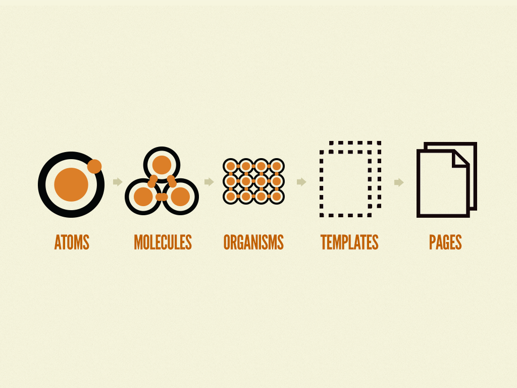
The atomic design system takes inspiration from chemistry. It consists of five distinct levels as follows:
- Atoms: Building blocks of the project, they can’t be broken down
- Molecules: A group of atoms are grouped together that become new properties
- Organisms: Group of molecules joined together to form a part of the interface
- Templates: Mostly focused on content structure
- Pages: Specific instances of templates
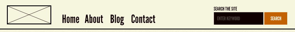
Atoms
Atoms are the basic building blocks of matter. Applied to web interfaces, atoms are our HTML tags, such as a form label, an input, animations or a button. Atoms can also include more abstract elements like colour palettes, fonts and even more invisible aspects of an interface like animations.
They can be considered the smallest possible components and can be applied in any context, globally or within other components and Templates, besides having many states, such as this example of a button: disabled, hover, different sizes, etc.
Tip: The Atoms should be written without margins and positions; Only the Molecules and Organisms can set the positions of atoms, but these stacks can’t have any styles of margins and positions;
However, like atoms in nature, they’re fairly abstract and often not terribly useful on their own.
Molecules
In chemistry, molecules are a group of two or more atoms that bind together and demonstrate new qualities. Consider the water molecule. It’s a combination of hydrogen and oxygen that together, create something new. With Atomic Design, designers can say the same about groups of components.
Atoms don’t make sense as a single component, but they can be combined to form Molecules. In web development, molecules are small, functional units that have the responsibility to do one thing.
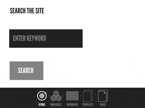
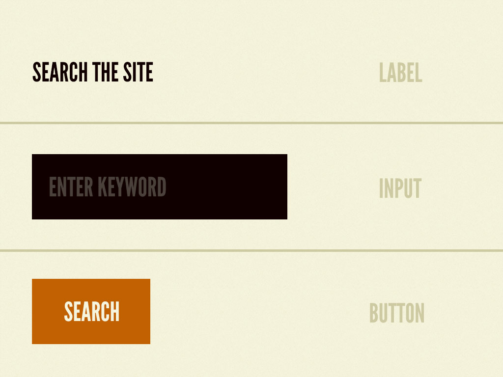
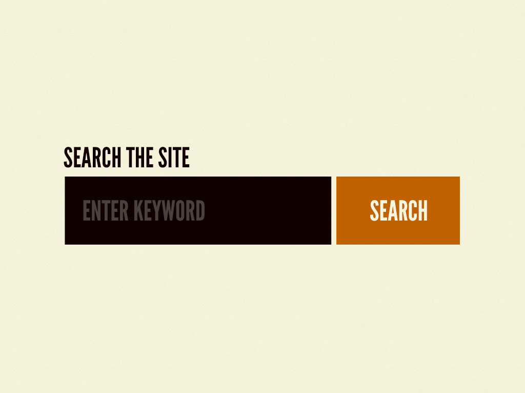
For example, the Label, Input and Button atoms can be combined to form a SearchBar molecule that’s responsible for accepting and passing user input to the application so that a search can be performed on the website.
Organisms
Organisms are the combination of Molecules that work together or even with atoms that compose more elaborate interfaces. At this level, the components begin to have the final shape, but they are still ensured to be independent, portable and reusable enough to be reusable in any content.
They can consist of similar and/or different molecule types. For example, a NavigationBar organism might consist of diverse components like a Logo, PrimaryNavigation, SearchForm, etc.
The Organisms at play can show the same Molecule over and over again, like most card-based lists, or show many different Molecules and Atoms. The bottom line is that Atomic Design means creating a way to design that is almost like a flexible puzzle, where designers can exchange Organisms within the same page according to what is needed.
Building up from Molecules to Organisms encourages creating standalone, portable, reusable components.
Templates
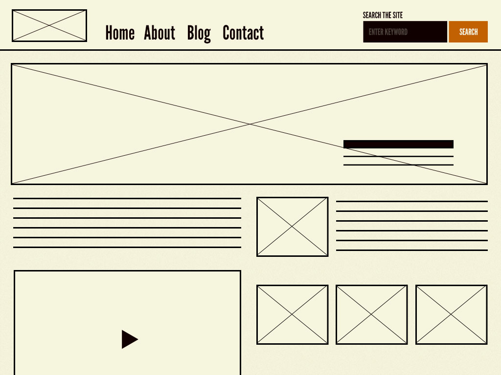
Templates consist mostly of groups of Organisms stitched together to form a complete webpage. It’s here where we start to see the design coming together and start seeing things like layout in action.
With this step, we’re leaving the biochemistry analogy.
Pages
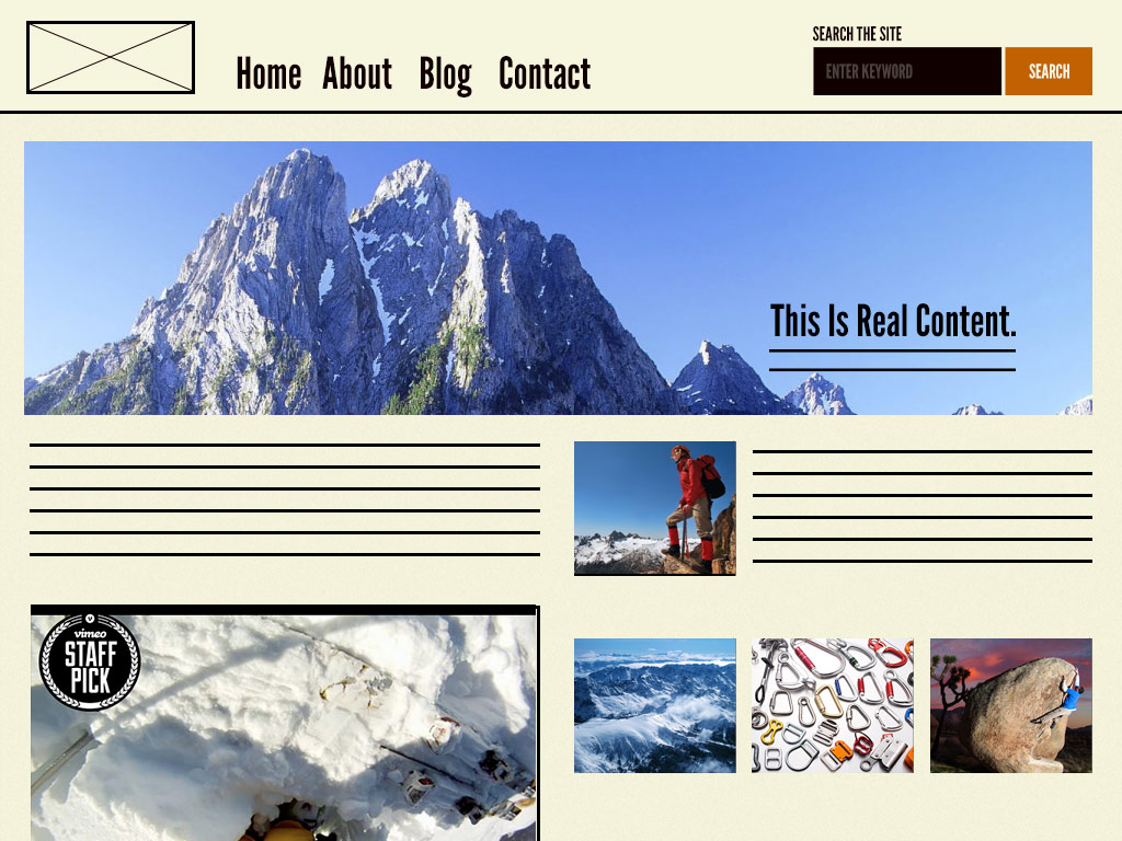
Pages are specific instances of templates. Here, placeholder content is replaced with real representative content to give an accurate depiction of what a user will ultimately see.
Pages are also the place to test variations in templates. For example, you might want to articulate what a headline containing 40 characters looks like, but also demonstrate what 340 characters look like. What does it look like when a user has one item in their shopping cart versus 10 items with a discount code applied?
These are the actual pages that we have been designing since the beginning of web design.
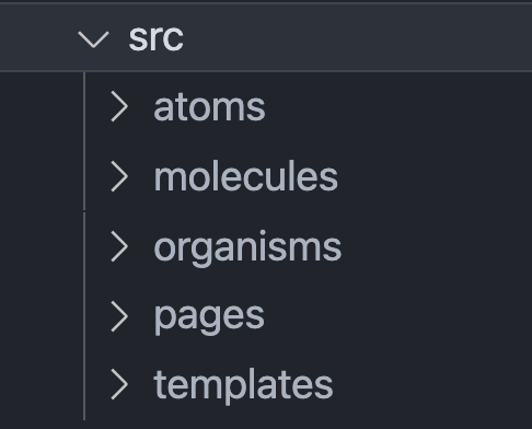
In frameworks with file-based routing like Next.js these pages (instances of templates can be placed there). In other frameworks/libraries like in React Native & React Router, we can have another layer/folder to handle the routing components.
Conclusion
The original source for this content is Brad Frost’s Atomic Design principles. Feel free to read about it on his blog (the source for the images in this article) and buy his book.
There’s a great starter kit called Atomic React that puts you in the right direction for implementing Atomic Design in your react apps.
Sources and further reading:
- https://bradfrost.com/blog/post/atomic-web-design
- Brad Frost – Atomic Design – Beyond Tellerrand 2013 https://vimeo.com/67476280
- https://github.com/bradfrost/patternlab
- https://www.justinmind.com/blog/atomic-design
- https://medium.com/@wheeler.katia/thinking-about-react-atomically-608c865d2262
- https://danilowoz.com/blog/atomic-design-with-react
- https://andela.com/insights/structuring-your-react-application-atomic-design-principles
- https://danilowoz.com/blog/atomic-design-with-react
- https://cheesecakelabs.com/blog/rethinking-atomic-design-react-projects
- https://dev.to/aliraza1603/atomic-design-methodology-with-react-and-typescript-1ac7
- Atomic Design: Design Systems and React - Cool But... - JS Roundabout - July 2018: https://youtu.be/ZzNUiBTdFTw
- Atomic Development: Sharing UI components - React Native London - November 2019: https://youtu.be/JbgjgHO-qMM
- Atomic Design with React & Typescript: a match made in heaven - Nathalia Rus - ReactJS Girls London: https://youtu.be/md_4vFeHKGI